Children’s room: Choosing the Colour

Pink for girls and light blue for boys? The interior designer and teacher Designers distrusts the traditional assignment and reveals what influence the colour scheme in the children’s room has on the offspring.
When Designers from viridian is elected to design a children’s room, we doesn’t follow a formula. Rather, we looks closely: how big is the room? How is it cut? How much sunlight shines in? And we asks about the nature of children?
The teacher and interior designer attaches particular importance to the last point: Is it a quiet or an active child? What are its preferences? And what tasks does it have to manage every day? “These are all important questions that need to be asked in order to create a coherent overall design.” And the colour scheme of the walls and floors plays a role here and pieces of furniture play an important role as part of a holistic room concept, as Designers also explains on the kids room page
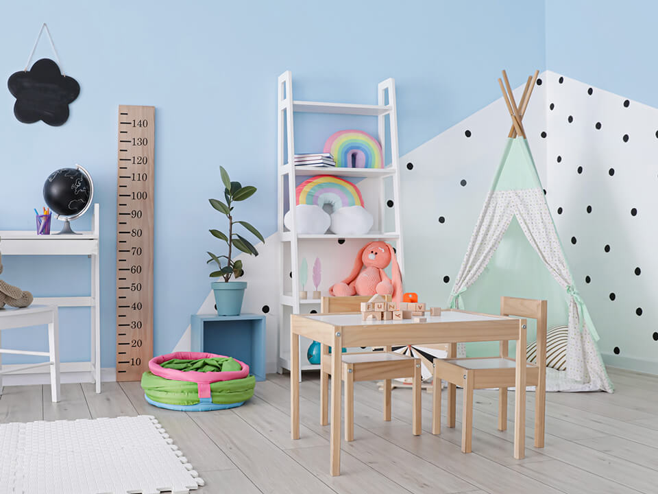
Pink for girls and light blue for boys – that’s a tradition in many children’s rooms. “These are cool colours,” Designers points out and instead suggests trying out different tones. A warm colour would be green with a yellow component. Or you can use particularly neutral sand tones. These are very suitable as basic colours in interior design. Because a warm or neutral basic colour scheme creates a pleasant atmosphere. “I think the standards of the industry are wrong, that children’s room always have to be colourful. Toys, books and other objects that are important for children and their development bring enough colour with them,” says Designers. In addition: The more reserved the basic colour scheme, the easier it is to set specific accents with posters, bed linen, a carpet or pieces of furniture and changed – depending on the needs or desires of the child It is always important to find a middle ground between lack of stimulation and over stimulation.
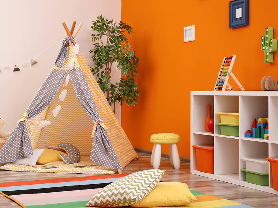
Green and yellow are calming, dark blue is also relaxing. On the other hand, red and orange as signal colours really grab people’s attention. Why is that? “Colours appeal to very specific basic instincts in humans. Red stands for danger. That’s why it has an activating effect, but it’s unsuitable if you have to concentrate on something or want to sleep,” explains Designers. Several red or orange accents can be used in a play corner where children are actively involved. What is invigorating in the play corner can be distracting at the desk. That’s why you should be extremely economical with red and lots of bright colours. Instead, you can signal the child with a calm colour: They are not playing here, but are working in a concentrated manner. But at that other criteria also play a role in colour design. “The smaller the rooms are, the brighter the colours should be,” the expert points out. This makes small rooms appear more spacious.
Let Children Choose Their Own
And what about the wishes of the children themselves? Should you decide over their heads or let them have a say? After all, it’s about their kingdom. “Children have desires that shouldn’t be disregarded, of course. But the problem is that their preferences can change quickly and often,” says Designers. For this reason, too, it is advisable to keep the basic colour scheme simple.
Her tip: Magnetic paints are a great idea to give children the opportunity to easily rearrange their room with their own ideas. You can easily attach pictures, posters or photos to the special coating yourself. In the children’s room, for example, designing with colours encourages the imagination instead of preventing it.


